A Nightmare on Elm Street (1984)

The Shining (1980)
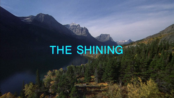
I found the opening credit sequence for The Shining extremely boring. The credits themselves were the primary focus of the entire opening. The scene was of a car driving up to the place where the film will be taking place. The title itself also appears around half way through the sequence, but it doesn't do anything for this opening like the title did for the previous one I mentioned. The credits constantly moving does keep the audience somewhat engaged in what it going on, at least in how long it will go on for, so I don't think I'll do something like this. I want my credits to flow better with what it happening in my opening to not bore my audience because of my limited time. (watch here)
Insidious (2010)

Much like a Nightmare on Elm Street, this opening split it's credit sequence in two. However, Insidious took a different approach to it. The first set of credits are displayed on their own, in a red font fading away in a smokey effect. They are meant to be the audiences primary focus. As the sequence continues, a light appears on the screen revealing the directors name. Following this a short scene displays a character sleeping followed by the title and next set of credits. This is where this one differed from the first. The second set of credits were presented in black and white clips, meant to look like old film roll footage, in the same red font making them stand out. I liked the way that there was a moment in between to keep the audience wondering what the character had to do with the film. It gave them a piece without giving anything away. I liked the the credits were presented in a way that wouldn't make them visually boring - the smokey effect - to keep audiences watching. (watch here)
Overall, I liked various elements about the sequences I watched and took a lot of inspiration from them. A Nightmare on Elm Street did a great job in incorporating the credits into the scene while still keeping the audience engaged. Insidious was able to do this as well, but in a way that highlighted the credits on their own. I also liked the title placement for all the films I mentioned, which I think is a crucial element of a good opening. My research gave me a good understanding of what I liked and didn't like about different sequences and what I wanted to include in my own.


No comments:
Post a Comment